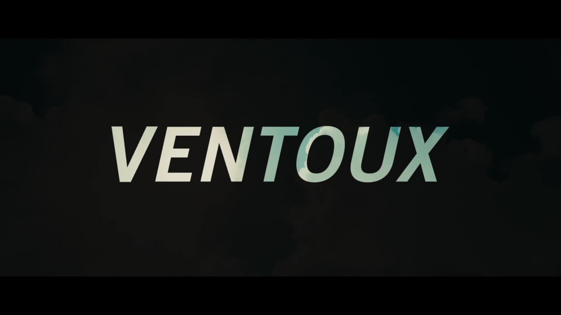
For this particular film, we’re proud that we designed the title sequence. The camera follows the yellow region bus through the meadows. When the first credits have been shown, the main title becomes visible in the distance. The letters create a mountain, as it were, the Matterhorn, in the flat Dutch landscape.
For the typography, we used typeface Univers. Not only does this typeface originated from Swiss. The clear and regulated character of the Universe also fits well with Fred's life.

