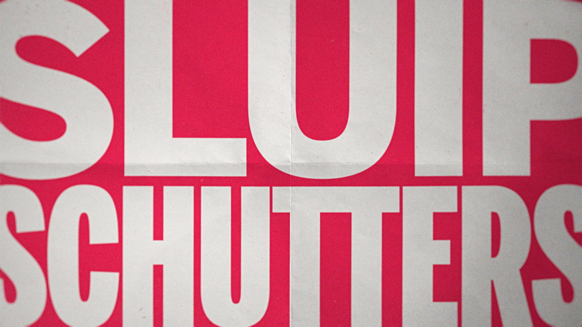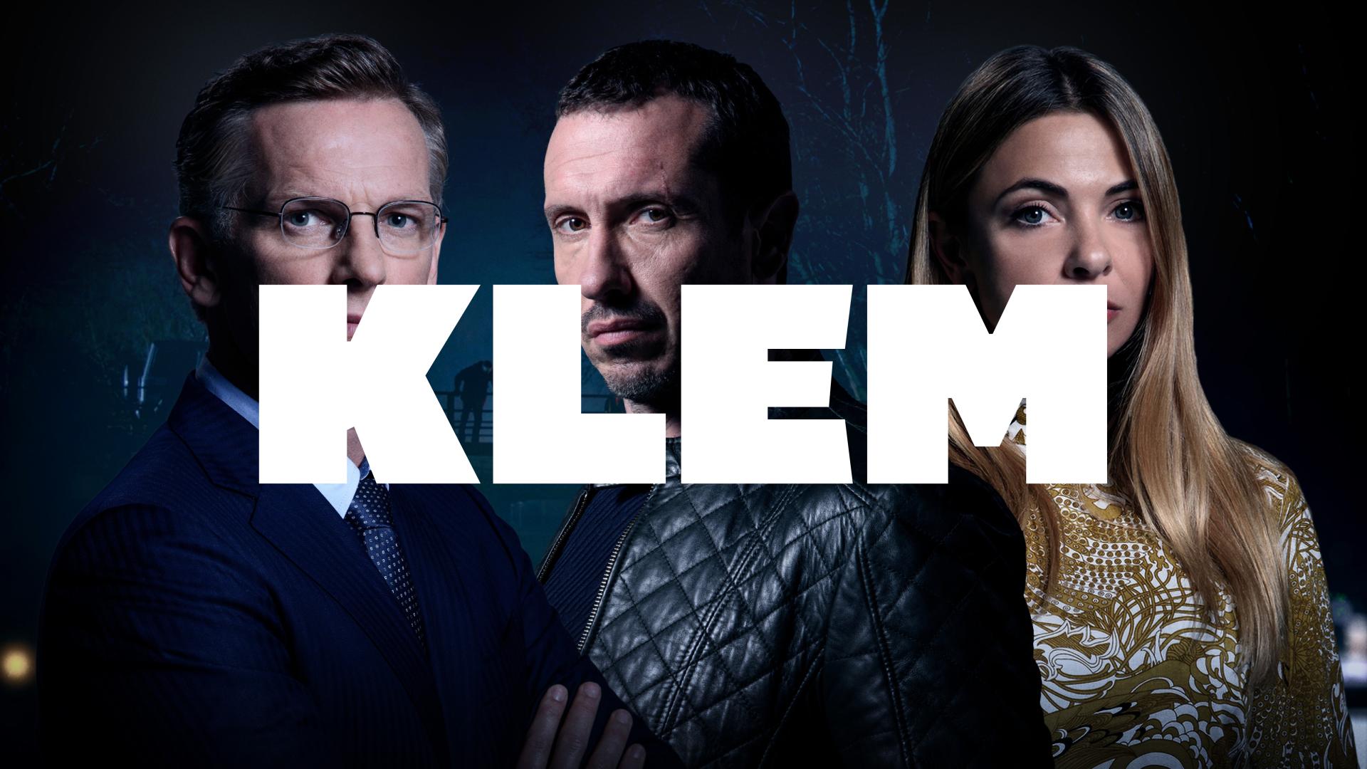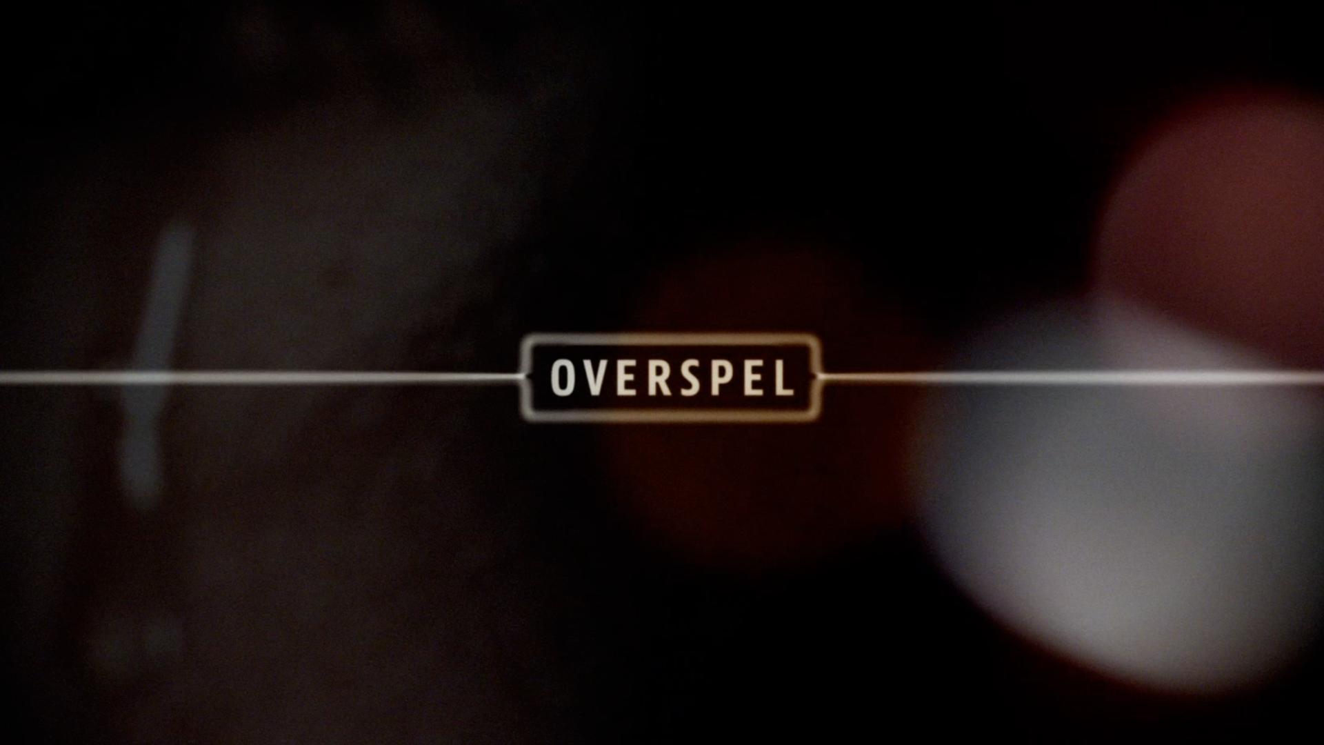
Doris is lovable, funny but also clumsy. We used these character treats in the design of the title sequence. We selected the Kurversbrug typeface, which is a digital redesign of the famous Amsterdam Bridges Letter (designed by Anton Kurvers around 1930). The clumsy but cheerful shapes of the letters connect well with the character of Doris. The story takes place mainly in Amsterdam, which made the use of this typeface all the more logical.
All the credits in the title sequence are animated in such a way that they interact in a funny way with the shots. Like Doris, they are a little clumsy and funny at the same time.
The design of the titles was very well translated to the poster and other printed promotional outputs. This is a good example of how consistent design can enhance the visual identity and thus the marketing of the film.


